Add content
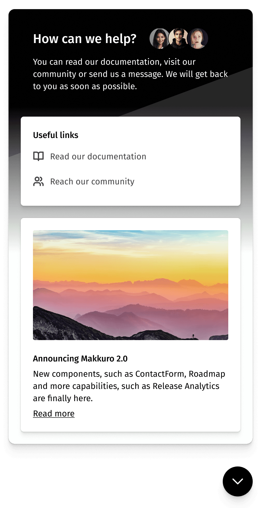
The content that is displayed in the <Messenger /> component is fully customizable by the viewOptions property.
Customize the Header
Providing a welcome message and some real human faces at the top of the messenger component can make it easier for users to reach out. By default, there is some text (a "How can we help?" title and a generic description below it) but you can further customize it to include working hours, a phone number, or any other information you think is relevant.
1
2
3
4
5
6
7
8
9
10
11
12
13
14
15
16
17
18
19
<Messenger
    publicKey='your-public-key'
    viewOptions={{
      header: {
        title: 'How can we help?',
        description: 'You can read our documentation, visit our community or send us a message. We will get back to you as soon as possible.',
        avatars: [
          {
            photoUrl: 'https://www.example.com/profile.jpg',
            name: 'John Doe',
          },
          {
            photoUrl: 'https://www.example.com/profile.jpg',
            name: 'Jane Doe',
          },
        ],
      },
    }}
  />
Altenatively, you can also provide a custom component to the header property and the messenger will render it instead of the default header.
1
2
3
4
5
6
<Messenger
  publicKey='your-public-key'
  viewOptions={{
    header: <YourCustomComponent />,
  }}
/>
Finally, if you don't want to render a header at all, just pass a null value:
1
2
3
4
5
6
<Messenger
  publicKey='your-public-key'
  viewOptions={{
    header: null,
  }}
/>
Customize the Panels
Every panel in the messenger component can be customized. You can change the text, the images, the order, and even add new panels. You can do that from the viewOptions.panels[] property.
1
2
3
4
5
6
7
8
9
10
11
12
13
14
15
16
17
18
19
20
21
22
23
24
25
26
27
28
29
30
31
32
33
34
35
36
37
38
39
40
41
42
43
44
<Messenger
  publicKey='your-public-key'
  viewOptions={{
    panels: [
      {
        type: 'conversations'
      },
      {
        type: 'links',
        content: {
          title: 'Links',
          links: [
            {
              href: 'https://www.example.com/docs',
              label: 'Read our documentation',
              target: '_blank',
              icon: <BookIcon />
            },{
              href: 'https://www.example.com/community',
              label: 'Reach our community',
              target: '_blank',
              icon: <CommunityIcon />
            }
          ]
        }
      }, {
        type: 'card',
        content: {
          image: {
            src: 'https://www.example.com/landscape.jpg',
            alt: 'Landscape'
          },
          title: 'Announcing Makkuro 2.0',
          description: 'New components, such as ContactForm, Roadmap and more capabilities, such as Release Analytics are finally here.',
          readMore: {
            href: 'https://www.example.com/blog/latest',
            label: 'Read more',
            target: '_blank',
          }
        }
      }
    ]
  }}
/>
There are three types of panels that you can use:
coversations, for which you don't need to provide acontentobject as Makkuro will render the Conversations list and button.links, for which you need to provide acontentobject with atitleand an array oflinksobjects. Thelinks[].iconproperty is an optional React icon that you can provide from your own library.card, for which you need to provide acontentobject where thetitleanddescriptionproperties are mandatory.
Hiding the Conversations functionality
As you may have noticed, you can omit the conversations panel from the viewOptions.panels[] array to hide the Conversations functionality. This is useful if you only want to use the Messenger component to provide some quick links or some content to your users.